


Health care information
Visit your patient portal
Make payments, submit copays, see your billing statements, view test results, schedule appointments and message your care team.
Health finances
Make your health care dollars go further
You’ll be surprised at all the everyday health items you can buy with your HSA and FSA card — saving up to 30% with pretax dollars.


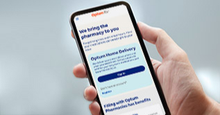
Online pharmacy
You’ve got better things to do than stand in line at the pharmacy
Optum Home Delivery Pharmacy brings your medications directly to your door and gives you 24/7 access to our licensed pharmacists — ready to answer any question.
A healthier you happens here
Find tips, ideas and information to inspire healthy living at any age, including topics important to you and your family.

Healthy living
Health screening tests for adults and how to get them
Staying on top of suggested health screenings doesn’t mean you have to pack your schedule with doctor visits. Knowing which ones are important and why can help you focus on what matters.

Health care finances
The best FSA eligible items you can buy before the end of the year
Overestimating your FSA can leave you with an excess of funds that you have to use by the end of the year, but there are a number of FSA eligible items you can pick up.

Healthy living
Supercharge your body this cold and flu season
Taking steps like getting the recommended vaccines and implementing healthy habits can help prevent respiratory infections while also helping to keep others around you healthy.
About us
Healthy Optumism
We’re helping solve the challenges in healthcare with a bold and optimistic outlook.

Join us
Explore Optum jobs
Check out current career opportunities to discover how you can start caring, connecting and growing — together with Optum.
Support
You’ve got questions, Optum has answers
Whether it’s about health care, financial or pharmacy-related services, we’ll help you find the answer you need.